Chapter 4 Quality Control Plot
High-quality ATAC-seq data allows us to see that there are circulating units of nucleosomes in the distribution of insert fragments of Tn5. At the same time, there is a clear enrichment at the gene transcription start site (TSS). According to the standard given by ENCODE, the enrichment score of TSS is at least 5 to be qualified.
4.1 plotFragments
The fragment size distribution. Due to nucleosomal periodicity, we expect to see depletion of fragments that are the length of DNA wrapped around a nucleosome (approximately 147 bp).
 plotFragments("F:/cisDynet/example/fragments_size",
              sample=c("Bulk_B","Mem_B","Naive_B","CD8pos_T","Naive_CD8_T","Gamma_delta_T"),
              plot_type="ridges")
## Picking joint bandwidth of 3.43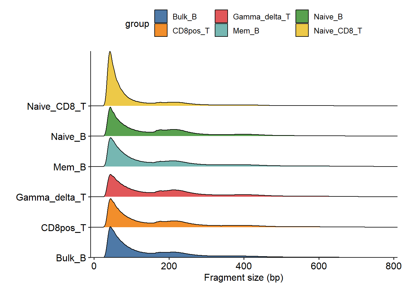
4.2 plotTSS
We can use plotTSS function to calculate the TSS enrichment score and visualize it.
plotTSS("F:/cisDynet/example/tss/",c("Bulk_B","Mem_B","Naive_B","CD8pos_T","Naive_CD8_T","Gamma_delta_T"), split_group = T)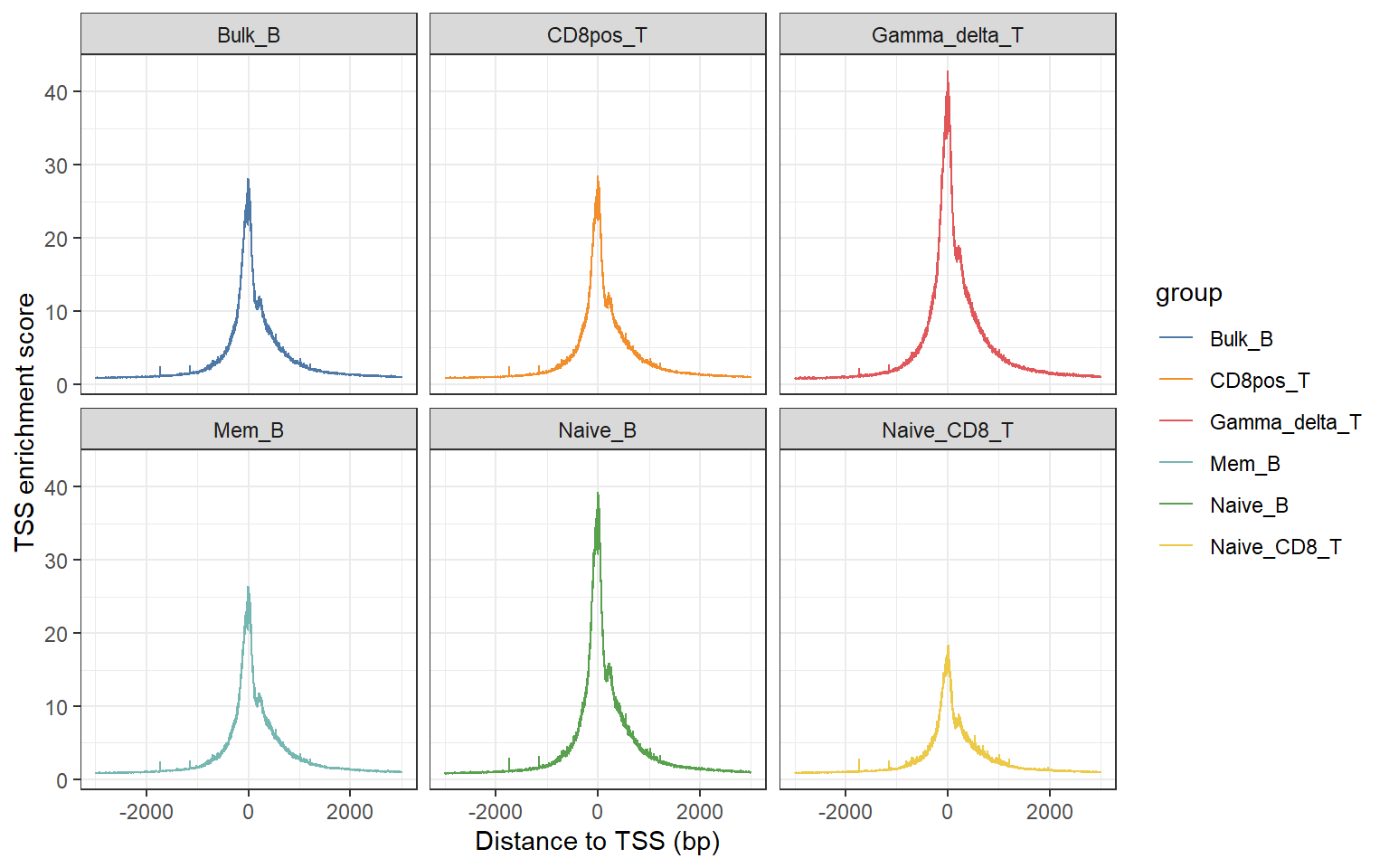
4.3 Quantification
In addition, reproducibility between biological replicates is another measure. Before we can make a judgment about how good or bad the biological replicates are, we need to quantify them. We can run quantification function to obtain the Tn5 cuts number in merged peaks and return the normalized matrix.
quant_mat <- quantification(sample_list= c("Bulk_B",
                                   "Mem_B",
                                   "Naive_B",
                                   "Plasmablasts",
                                   "CD8pos_T",
                                   "Central_memory_CD8pos_T",
                                   "Effector_memory_CD8pos_T",
                                   "Naive_CD8_T",
                                   "Gamma_delta_T",
                                   "Effector_CD4pos_T",
                                   "Follicular_T_Helper",
                                   "Memory_Teffs",
                                   "Memory_Tregs",
                                   "Naive_Teffs",
                                   "Regulatory_T",
                                   "Th1_precursors",
                                   "Immature_NK",
                                   "Mature_NK",
                                   "Monocytes",
                                   "pDCs"),
                            peak_path="F:/cisDynet/example/peaks",
                            cut_path="F:/cisDynet/example/cut_sites/",
                            save_file_path="F:/cisDynet/example/")
dim(quant_mat)
## [1] 118704 204.4 PCA
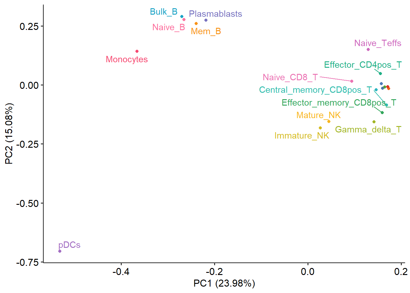
If two samples are close together in a PCA plot, it indicates that their ATAC-seq profiles are similar, while if two samples are far apart in a PCA plot, it suggests that their ATAC-seq profiles are significantly different. PCA analysis can assist in identifying potential outlier samples. In a PCA plot, an outlier sample may manifest as a point that deviates substantially from the clustering of other samples or exhibits a distinct distribution pattern compared to the other samples.
plotPCA(norm_data=quant_mat)